
Best Colors to Wear for Headshots

“What should I wear?” and “What colors photograph best?”
These are two of the most common questions I’m asked by headshot clients. The short answer is there isn’t one perfect color for universally flatters everyone. The more helpful answer? There are colors that consistently photograph better.
This guide will walk you through how to choose colors that look polished, professional, and natural on camera, with real-world insight from photographing hundreds of people.
Best colors to wear for professional headshots (quick guide)
If you want the highlights before diving in, start here:
Best overall: navy, charcoal gray, warm & cool neutrals
Great with personality: muted jewel tones such as burgundy, emerald, teal, plum
Use carefully: saturated colors like bright red, hot pink, bright turquoise
Avoid: neon colors, busy patterns, overly trendy shades
Look for: texture, not pattern
When in doubt, choose a color that:
complements your skin tone
doesn’t distract from your face
feels like you
Why clothing color matters in professional headshots
The primary goal of your headshot is to build trust and recognition by drawing attention to you. Anything that competes with your face (bright colors, distracting backgrounds, or poor outfit choices) works against that goal.
Choosing outfits with texture instead of patterns adds visual interest without distraction. Thoughtful color choices also help prevent unwanted color casts on skin and keep your headshots looking clean and put together.
Neutral colors for headshots
Neutrals are popular for a reason: they’re timeless, and most people already have great options in their closet.
White: Crisp white is classic and polished, while softer whites like ivory or cream often photograph more gently. Just be sure light-colored clothing is clean and wrinkle-free, and fully opaque - it’s worth checking undergarments to make sure nothing shows through.
Gray: Charcoal and darker grays are excellent alternatives to black when you want something professional but softer.
Black: Black can absolutely work, especially with good lighting and contrast. Proper fit matters here - avoid baggy clothing to prevent unflattering silhouettes.
Beige: Warm neutrals like camel, tan and taupe feel approachable and natural, especially when paired with darker layers or backgrounds.

Wearing neutral colors for headshots
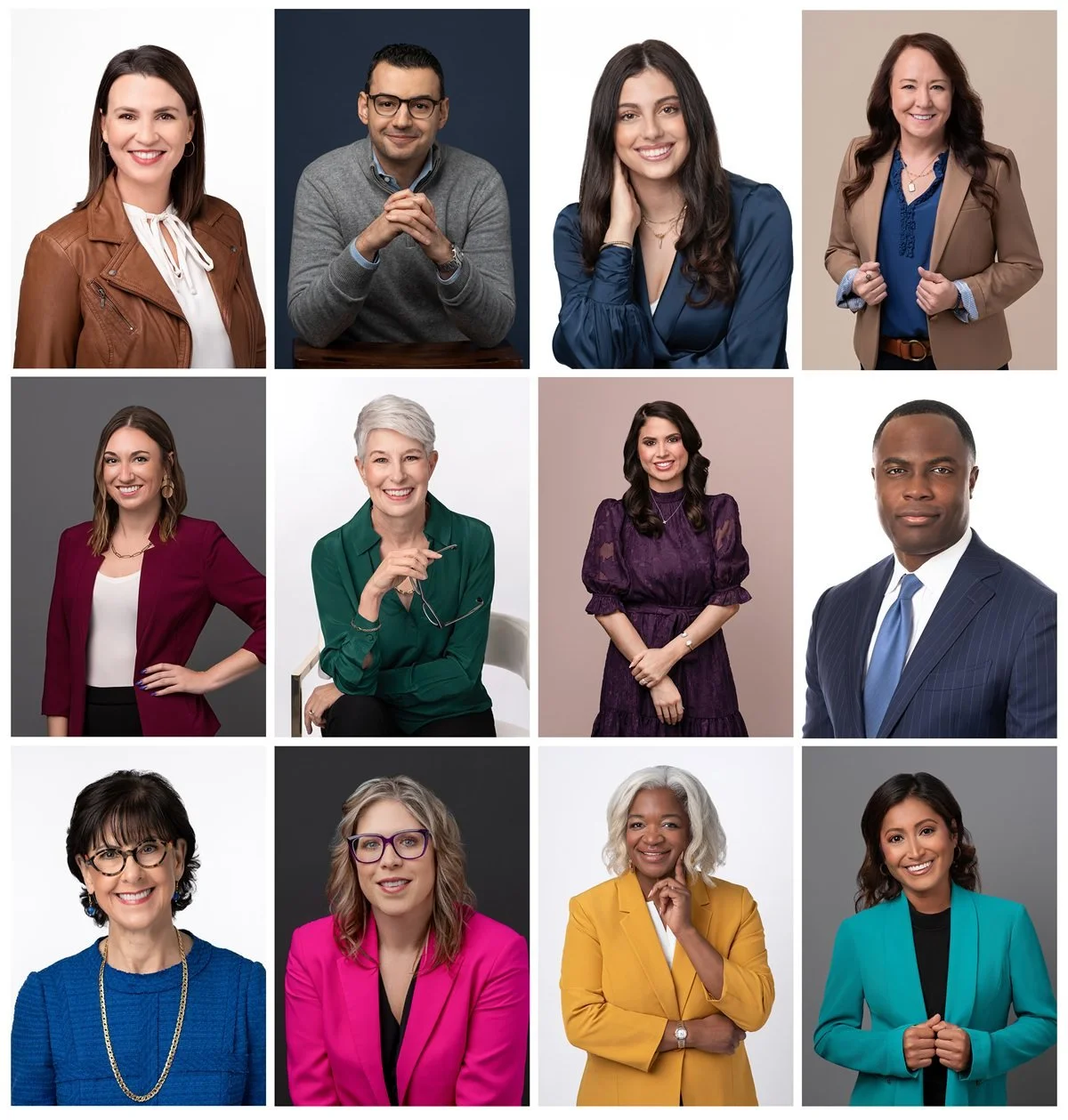
Vibrant colors for headshots
Color can add personality to your headshots. Whether it’s your entire outfit or just a small pop of color, it should be intentional.
Muted colors typically photograph better than bright, saturated ones. Think burgundy instead of fire-engine red, emerald instead of neon green. Mid-tone colors (not too light, not too dark) tend to be the most forgiving on camera.
Warm colors like reds, oranges, and yellows often feel energetic and inviting. Cool colors like blues, greens, and purples typically give a sense of calm and stability. Depending on your skin tone and hair color, you likely gravitate toward one group naturally, and that’s usually a good clue.
A small pop of color can be incorporated through:
a blazer layered over a neutral top (or vice versa)
a tie or pocket square
a scarf
shoes
subtle jewelry (earrings, necklace)
lipstick or nails

Wearing a pop of color for headshots
Color psychology in headshots
There’s a whole field of research around color and the emotions it can evoke. While I wouldn’t base your wardrobe choices solely on color psychology, it can be interesting (and occasionally helpful) to understand the common associations people tend to make in Western culture:
Red: action, confidence, power
Orange: enthusiasm, creativity, friendly
Yellow: optimism, energy, warmth
Green: growth, balance, nature
Blue: calm, trustworthy, security
Purple: imaginative, royalty, ambitious
Black: authority, sophistication, formality
Brown: reliability, stability, wisdom
White: simplicity, clarity, goodness
Here’s the important part: most people aren’t consciously analyzing your color choice. What they do notice is whether you look confident, comfortable, and approachable. Color psychology can add a subtle layer to your headshots, but it should never override what photographs best on you.
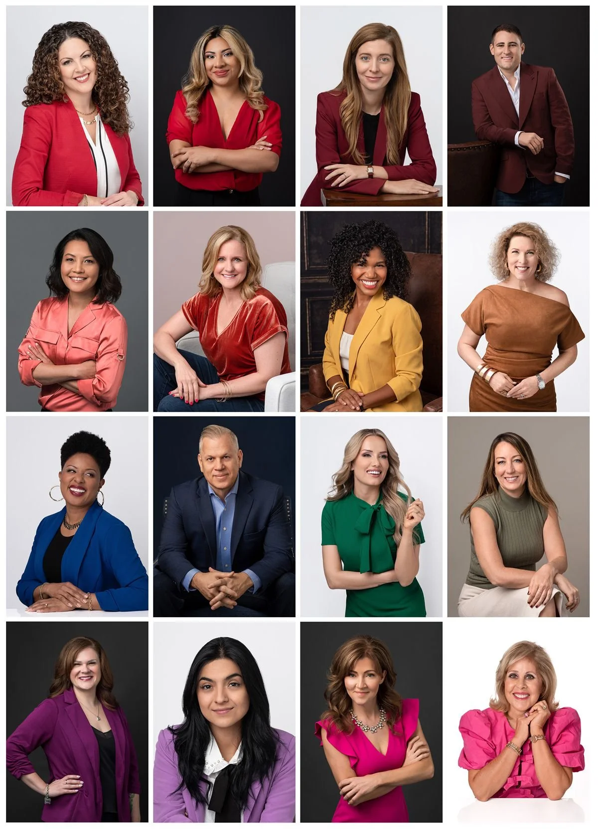
Wearing vibrant colors for headshots
Choosing headshot colors based on your industry
Context matters. Your headshot should feel appropriate for the work you do.
For corporate and traditional industries, darker neutrals and muted colors like navy, charcoal gray, and subtle jewel tones tend to work best. These feel professional without being stiff, and many companies even provide wardrobe guidance so team photos look cohesive.
Creative fields allow more flexibility. This is where richer colors, textures, or signature tones can shine, as long as they don’t overpower your face.
If you have brand colors, those can absolutely work in headshots to build brand recognition, especially for entrepreneurs and personal brands. Rather than wearing them head-to-toe, consider using them as accents or choosing a complementary shade for a more balanced look.
Coordinating outfit and background colors
When coordinating clothing and background colors, the goal is simple: enough contrast to stand out, without creating visual tension. Contrast doesn’t have to be extreme. It can come from differences in lightness, saturation, or hue: just enough separation so you don’t blend into the background.
You’ll often hear advice to avoid wearing white on a white background or black on a black background. While that’s a helpful rule of thumb, it isn’t absolute. With thoughtful lighting and styling, an experienced photographer can make even these combinations look intentional and polished.

Example headshots: white outfit on white background, and black outfit on black background
From a color theory standpoint, complementary colors (those opposite each other on the color wheel) create the strongest contrast and a bold, eye-catching look. Analogous colors (those next to each other on the color wheel) create a softer, harmonious palette. If that sounds too technical, don’t worry: my job is to make sure your clothing & background work together to help you achieve your desired look.
For most corporate headshots, subtle contrast tends to photograph best. Bolder pairings are great for social media to create scroll-stopping images.
Colors to avoid for professional headshots
Some colors cause issues so consistently that they’re best skipped.
Neon colors: Fluorescent shades reflect onto skin and distract immediately. They’re rarely flattering and very difficult to correct later.
Seasonal & trendy colors: Trendy colors date quickly. Since you’ll likely use your headshots for years, choose colors and styles that looks in season year-round.
Wrong for your skin tone: Matching your skin tone too closely can make you look flat, while clashing tones can emphasize redness or unevenness.
All white or all black: These are often labeled a definite “don’t,” but in my experience, they can absolutely work with the right lighting, fit, and contrast. If you’re unsure, add a layer, pair white or black with another color, choose a softer variation, or talk it through with your photographer.
Choosing colors that flatter you
Do you have a signature color you love to wear and feel great in?
Which colors do people compliment you on in real life?
Is your skin’s undertone cool, warm, or neutral? If you don’t know, you can schedule a personalized color analysis with an expert stylist to determine your color season. It’s fun and informative!
The guidelines here are just that, not laws. If something feels authentically you and photographs well, great! Confidence shows, and the camera picks up on it.
Colors that photograph well (from a professional photographer)
After photographing thousands of people, patterns I see:
Classic (safe and timeless)
Navy, charcoal gray, soft white, muted neutrals
Modern (polished with personality)
Burgundy, emerald, teal, plum
Bold (stop the scroll!)
Red, hot pink, yellow, royal blue
Bringing several options allows flexibility. Slight changes in lighting, background, or expression can make one color work better than another. I recommend clients bring 3 outfits to their headshot session: something light, something dark, and a pop of color. Clients are often surprised by how different colors look on camera compared to in the mirror, and sometimes the outfit they almost left at home ends up being the surprise favorite!
✨ Pro tip: Want to draw attention to your headshot on LinkedIn? Choose a bold color.
Classic, modern, and bold colors that photograph well for headshots
Common questions about headshot colors
-
Yes. Muted, mid-tone colors tend to photograph best and keep attention on your face.
-
Neon colors, overly bright shades, busy patterns, and anything very trendy.
-
Solid colors are recommend over busy patterns and prints. But if you’re a rule-breaker, yes, bring your colorful Hawaiian shirt!
-
I recommend three: something light, something dark, and a pop of color.
At the end of the day, the best color to wear for your headshot is one that photographs well, complements your features, and feels natural and confident when you put it on.
Still unsure what to wear? If you’re planning a headshot session in Houston and want help choosing outfits, I’m happy to offer personalized guidance so you feel confident in front of the camera.
Megan Murray is a headshot photographer in Houston. To learn more about updating your own headshot, get in touch!